Cloud Infrastructure Management KPIs for CTOs and IT Directors

Content authorBy Irina BaghdyanPublished onReading time13 min read
Title:
Cloud Infrastructure Management KPIs for CTOs and IT Directors

Meta description:
This Explainer shows you how to set cloud KPIs with owners and thresholds so you can make monthly decisions.

A

A useful cloud KPI report shows service health and resilience. It also shows security exposure and capacity, along with change performance and cost. Each indicator needs a threshold and an owner who carries a defined corrective action. Everything else belongs in engineering tooling. The report exists to produce decisions each month.

What makes a monthly report useful?

A monthly report is useful when every line on it can trigger a decision. That means each indicator carries a target and a red-amber-green threshold, assigned to a named owner with a documented consequence when the threshold breaks. Activity counts fail this test. Tickets closed, alerts processed, and virtual machines provisioned describe effort, not outcome, so they can't tell you where to intervene.

The waste is measurable. Flexera's 2026 State of the Cloud Report found that 29% of cloud spend is wasted, the first increase in five years, while organizations exceeded public cloud budgets by 17%. Waste at that scale persists in environments that are already heavily instrumented, which tells you that nobody owns the exception.

So apply one filter before an indicator earns a place on the report. If the number moves and nothing happens, remove it. Keep the metric in your monitoring platform where engineers can query it, and leave the report for figures that carry consequences.

Which indicators belong on the executive dashboard?

The executive dashboard is one page of red-amber-green status by service area and the decisions leadership must make this month. Material trends and breached thresholds appear on that page, as do unresolved risks. Technical depth belongs in supporting engineering sections that anyone can open when a status turns amber. The page answers what changed and what needs a decision.

Keep the count tight. Set up to 10 strategic KPIs to avoid cognitive overload during a short review. Six status lines mapped to the six domains from the previous section fit that range with room for a decisions block.

Structure the page in this order:

  1. Status by domain, with the prior month's status beside it so direction is visible

  2. Breached thresholds, each with an owner and a target resolution date

  3. Decisions required this month, with the option you recommend

The recommendation column matters more than the status column. A dashboard that reports amber without proposing an action pushes analysis back onto the meeting, which is where reporting cycles go to die.

Is service reliability meeting its targets?

Reliability status comes from availability against target and the mean time to restore (MTTR) trend. Service level objective (SLO) attainment and error-budget position sit with significant incident count and customer impact. Report whether reliability is improving or degrading over the last quarter.

Error budget is the figure that converts reliability into a decision. Google's Site Reliability Engineering practice defines the budget as 1 minus the SLO, and its published policy halts all changes except P0 issues and security fixes when a service exceeds that budget across a four-week window. Google also attributes roughly 70% of its outages to changes.

Which gives leadership a cleaner question than "why did we have an outage?" Ask instead how much budget is left and what the release policy does when it runs out. If your organization has no answer to the second half, reliability reporting is descriptive rather than operational, and the availability percentage on the page is just a number with no lever attached to it.

Can critical services recover reliably?

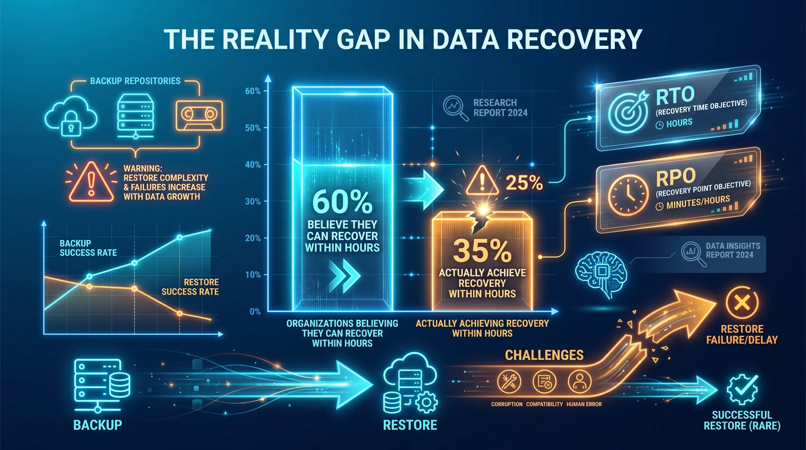
A vibrant neon infographic with a central split bar chart highlighting recovery statistics, surrounded by glowing icons and overlays.

Recovery status needs backup success rate and the results of actual recovery tests. Count and age of failed jobs sit beside overdue remediation items, and recovery time and recovery point performance are measured against objectives. A successful backup job proves data was written without proving you can restore a service, which is why the two figures belong in separate columns.

The gap between confidence and capability is documented. Veeam's research across 1,300 organizations found that 60% of organizations believe they can recover within hours while only 35% achieve it. The same research found that 96% of ransomware attacks targeted backup repositories and succeeded 76% of the time.

Report verified recoverability as its own indicator with its own threshold: which critical services were restored in a test this quarter and how long the restore took, with a note on whether the restored data was scanned before reintroduction. Green on backup completion with no recovery test behind it is the most expensive false comfort in the report, because you only discover the error at the moment you have no alternative.

Need IT Support?

Book a free consultation with ABS Technologies experts we'll help you find the right managed IT, cloud, or security solution for your business.

Book a Free Consultation

Are security exposures within tolerance?

Security status is the count of open critical vulnerabilities and patch compliance against your agreed window. It also tracks the age profile of approved exceptions and any material risk that exceeds tolerance. Attach an accountable owner and a target date to each exposure, because an unowned vulnerability list generates discussion instead of remediation.

Set thresholds against measured reality. The Verizon 2026 Data Breach Investigations Report found that only 26% of CISA Known Exploited Vulnerabilities were fully remediated during 2025, down from 38%, with median time to full resolution rising from 32 to 43 days as the median organization faced 50% more critical vulnerabilities than the year before.

That trend has a direct consequence for how you report. If remediation capacity is flat while inbound volume grows by half, a patch compliance percentage will decline even when the team performs better than last year. So report the backlog trend and the count of accepted exceptions alongside compliance, and force an explicit acceptance decision on anything ageing past its target date.

Is cloud spending controlled?

Cost status compares actual spend with budget and with the prior period. It also explains every material variance by service and driver as it quantifies optimization work already completed against work planned. Attribute the variance to something specific: a migration or a demand change.

Idle capacity is where most variance hides. Datadog's State of Cloud Costs research found that 83% of container costs come from idle resources, with 54% of that from cluster overprovisioning and 29% from resource requests larger than workloads need.

Report savings opportunities with their risk attached, because those two idle categories carry different consequences. Trimming workload requests touches individual services and can be reversed quickly. Shrinking cluster headroom removes the buffer that absorbs demand spikes, which is a capacity decision wearing a cost label. Present each optimization with the reliability implication beside the dollar figure so leadership approves the trade.

Which engineering metrics explain executive status?

Engineering sections exist for one purpose: to explain every red or amber indicator on the executive page with enough depth that the explanation survives a follow-up question. They sit behind the summary, and they answer why a status moved.

The discipline here is definitional, not analytical. Teams need a named metric owner, a senior site reliability engineer or engineering manager, who validates data quality and enforces consistent measurement.

Three sections cover the diagnostic ground:

  • Incident and alert quality, which explains reliability status

  • Capacity health, which explains both cost and reliability status

  • Configuration and change control, which explains most of what breaks

Each engineering section ends with the corrective action already in progress. If the diagnostic section can't name the work underway, the executive status has no route back to green, and next month's report will carry the same amber with a longer explanation.

Are incidents and alerts actionable?

Incident reporting needs severity breakdown and recurrence of the same root cause. Detection and recovery times sit with cause categories and overdue post-incident actions. Alert reporting needs the noise picture of false positive rate and duplicate volume. It also tracks the share of alerts that required no human response at all.

Noise is measurable and worse than most teams assume. The Microsoft and Omdia State of the SOC 2026 report found that 46% of all alerts prove to be false positives, and the 2025 SANS Detection and Response Survey found 73% of security teams name false positives as their top detection challenge.

Recurrence and alert noise belong on the same line of the report because they share a cause. When half of what reaches a queue needs no response, the signal that does matter gets triaged late, which extends detection time and pushes the same root cause into next month's incident list. So track overdue post-incident actions as a leading indicator of recurrence. A backlog of unclosed actions predicts your repeat incidents better than the incident count itself.

Need IT Support?

Book a free consultation with ABS Technologies experts we'll help you find the right managed IT, cloud, or security solution for your business.

Book a Free Consultation

Is infrastructure capacity healthy?

Capacity reporting shows utilisation and saturation risk by critical service. Forecast demand against available headroom sits beside idle resources, and the report flags any constraint that would block scaling. List exceptions. A table of every instance in the estate tells you nothing that a saturation ranking of your top ten services doesn't tell you faster.

Utilisation baselines are low across the industry. Datadog's State of Cloud Costs 2025 reported average CPU utilisation of 18% in Kubernetes environments, a figure consistent with the 12% to 18% range observed across enterprise clusters.

Low average utilisation and genuine saturation risk coexist, which is exactly why capacity needs per-service reporting. The average tells the finance conversation that you're overprovisioned. The per-service view tells the reliability conversation that two workloads are near their ceiling with a demand increase scheduled. Both are true, and reporting only the average is how organizations cut headroom out of the service that needed it most.

Are configurations and changes controlled?

Change reporting covers configuration drift against approved baselines and change failure rate. Unauthorised changes detected sit with deployment success and rollback counts. Link every failure and every drift finding to the affected service and the remediation work, with the control that will prevent a repeat.

Change failure rate has a published benchmark. The 2024 DORA State of DevOps report placed elite performers near a 5% change failure rate with high performers around 10%. Medium performers sit at 15% and low performers at 64%. Those bands make your own figure interpretable.

Drift is the harder half. Reported drift figures show configuration divergence from approved baselines sits behind a majority of cloud breaches, and detection commonly runs past 180 days, which means an undetected drift finding is a security exposure that hasn't been counted yet. Report drift alongside your vulnerability numbers, because the two feed the same risk register and compete for the same remediation capacity.

How should each KPI be defined?

Every KPI on the report needs nine attributes recorded in a definitions register. Name and calculation sit with scope and data source. Reporting owner and target come next. The red-amber-green threshold pairs with the corrective action when breached. The action owner completes the register. Without that register, each monthly meeting reopens the arithmetic instead of discussing the result.

Definitional drift is the documented failure mode for incident metrics in particular. It identifies misleading definitions and inconsistent timestamp collection as the main threats to MTTR accuracy, since organizations define detection and resolution boundaries differently.

Document exclusions with the same care as inclusions. State whether planned maintenance counts against availability and whether load-test traffic consumes error budget. Also state whether a rollback within five minutes counts as a change failure. These choices are the ones people argue about when a status turns red, and settling them in advance is what keeps the argument about the service instead of the spreadsheet. Version the register and record who approved each change.

What should leaders ask each month?

Five questions turn a report into a decision record. The first two ask what got worse since last month and why each threshold was breached. The next two ask whether any incident cause has now recurred and which risks need formal acceptance. The last asks whether every corrective action has an owner and a deadline with a measurable outcome. Ask them in that order.

The financial weight behind these questions is documented. In Uptime Institute's 2025 annual survey, 57% of respondents said their most recent major outage cost more than $100,000, and for the second consecutive year one in five reported costs above $1 million.

The recurrence question is the one that changes behaviour fastest. A first incident is an event, and a second incident from the same cause is a control failure that your post-incident process failed to close, so the two deserve different responses from leadership. Record the answers in the report itself. A decision that lives only in someone's memory can't be checked next month against what actually happened.

Trends matter more than snapshots

Read every indicator as a trend before reading it as a status, because a single green month hides deterioration that a rolling three-month view exposes immediately. Report the current month and the prior month side by side for each domain covered above, with a rolling comparison next to them.

Trend framing is standard practice in financial reporting for the same reason it belongs here. Onetribe Advisory's guidance on executive dashboards recommends showing six to twelve months of trend data per KPI, which allows pattern recognition and reduces overreaction to normal variance.

Annotate the movements. A cost increase after a migration and a reliability dip during a demand spike need a note attached to the month they occurred in, as does an MTTR improvement following an on-call change. Annotation is what stops the same explanation being reconstructed from scratch two quarters later, and it's what lets you prove an optimization worked instead of asserting it. Unexplained movement in either direction is an open question.

Who can operationalise cloud reporting?

Building this framework takes an assessment of current cloud operations and agreed technical benchmarks. It also takes the operational capacity to close the exceptions the report surfaces each month. Most internal teams can produce the report. Fewer have spare capacity to run the remediation it generates alongside existing delivery work.

ABS Technologies has operated as a managed IT services provider since 2011 and works on a vendor-independent basis, which means procurement and platform recommendations carry no brand bias. Its portfolio covers Cloud Services and DevOps and managed IT. Information systems continuity and security belong in the same portfolio, as does audit. The work extends to infrastructure as code and containerisation, along with cloud cost and performance optimisation.

That combination matters for reporting specifically. The same team that defines your KPIs and thresholds, along with the ownership model, can also carry the corrective actions, so exceptions don't stall between the party that identified them and the party that fixes them.

Start with an assessment of your current cloud operations and the metrics you already collect. That establishes the baseline your thresholds get set against, and it identifies which indicators on your existing dashboards have no owner and no threshold, and therefore no consequence.

Need IT Support?

Book a free consultation with ABS Technologies experts we'll help you find the right managed IT, cloud, or security solution for your business.

Book a Free Consultation

Review executive KPIs monthly, but review underlying operational signals at a cadence tied to service criticality. A customer-facing production service needs daily review, while a lower-priority internal workload can use weekly review. Escalate immediately when a red threshold is breached rather than waiting for the scheduled report.

Use the definitions register to designate one source of record for each KPI. Check event timestamps and the population included before publishing the figure. If the discrepancy remains unresolved, mark the KPI as data-quality amber, assign an owner, and set a correction date.

Set the initial target from the service’s documented business requirement and technical design, then compare it with an early operating baseline. Record the target as provisional until the register’s defined observation period ends. The service owner should approve both the target and the response required after a breach.

An accountable business or service owner should approve a temporary exception because that person accepts the consequence of reduced reliability, security, or cost control. Record the rationale and expiry date in the risk register. The exception should expire unless its owner renews it after review.

Yes. Automate collection from monitoring and billing systems where metric definitions are stable. A named owner still needs to validate unexpected movements and confirm that a breached threshold has a corrective action. Automation reduces manual compilation, but it can’t determine whether leadership should accept a risk.

Schedule a Meeting

Book a time that works best for you and let's discuss your project needs.

You Might Also Like

Discover more insights and articles

Title:
Cloud Managed Service Provider: A Practical Evaluation Framework

Meta description:
Evaluate a cloud managed service provider with this framework so you can set requirements and test contracts

Cloud Managed Service Provider: A Practical Evaluation Framework

Evaluating a cloud managed service provider gets harder once you're already running production workloads. Here's a working method for setting requirements and testing the contract before you sign it.

Title:
Cloud Migration Consulting Services: What Expert Support Should Deliver

Meta description:
Learn how cloud migration consulting services guide you to evaluate provider proposals as you manage d

Cloud Migration Consulting Services: What Expert Support Should Deliver

You need cloud migration consulting when the destination is clear, but the path isn't. A good migration consultant hands you named, checkable outputs at every stage: a dependency map, a landing zone design, tested rollback procedures, signed-off runbooks, plus a clear line showing where their job ends and yours begins. This guide sets out what to ask for, what a credible proposal looks like, and the mistakes that turn a migration into a budget overrun: vague scope, untested rollback plans, and no named owner for risk.

Enterprise storage server in a modern data center.

Cloud Disaster Recovery Services: How to Evaluate Recovery Readiness

Most technology leaders have a disaster recovery runbook. Far fewer have a recovery capability they can prove will work under pressure. According to the Veeam 2024 BC/DR survey, only 32% of organizations believe they can recover 50 workloads within a full business week. The problem is that manual runbooks, undocumented dependencies, and human-driven failover steps break down when the environment is compromised. In 2026, if your disaster recovery strategy still depends on people clicking through a sequence of recovery steps, you are planning around a point of failure. Modern cloud disaster recovery services should use automated DevOps pipelines to rebuild, validate, and recover the environment consistently.

Title:
AWS MSP Proposal Scorecard: Scope, SLAs, Security and Cost

Meta description:
Use this AWS MSP Explainer to compare bids and spot hidden costs before you choose support suited to your risk need

AWS MSP Proposal Scorecard: Scope, SLAs, Security and Cost

Use pass-fail gates to screen shortlisted AWS managed service provider (MSP) proposals, then score the survivors against a normalized workload baseline and a weighted 100-point model before you look at price. This exposes the exclusions and customer-owned work hidden inside low monthly fees, as well as charges for third-party tools. Procurement can then work with engineering and security to rank bids on risk-adjusted value.